

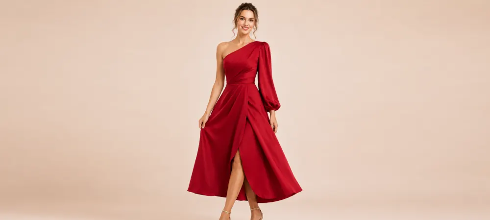
How to Choose a Dress Color That Makes You Glow
The dress fits beautifully, the shape feels right, and the mirror should be delivering charm. Yet something seems quiet. Then you try the same design in another color, and suddenly your eyes look brighter, your complexion appears alive, and your expression changes. That moment is not imagination. Color can frame your face, influence your mood, and turn a lovely dress into one that feels unmistakably yours. Choosing well doesn’t require memorizing complicated charts or surrendering to seasonal rules. With a little observation and experimentation, you can find shades that illuminate you, suit your lifestyle, and inspire confident purchases consistently.
The Fitting-Room Moment When Color Changes Everything
Picture a shopper arriving with one firm rule: she always wears black. It feels dependable, coordinates easily, and never demands a debate. While searching for an event dress, she carries three familiar dark options into the fitting room. On impulse, the assistant adds a deep green style to the rail.
This is what a supportive color can do. It doesn’t alter your face or body. It changes the relationship between your complexion, hair, eyes, fabric, and surrounding light. A harmonious shade allows people to notice your first. A difficult shade may draw attention to shadows or make the garment appear separate from the wearer.
Begin With Your Undertone, Not a Rigid Label
Skin undertone describes the subtle coloring beneath the surface. It is commonly grouped as warm, cool, or neutral. Warm undertones may appear golden, peachy, or yellow; cool undertones may seem pink, red, or bluish; neutral undertones often show a balanced mixture.
Several quick checks can offer clues. Look at the veins near your wrist in natural light. Greenish veins may suggest warmth, while blue or purple may suggest coolness. Consider whether gold or silver jewelry creates greater harmony near your face. Notice whether cream or crisp white feels more illuminating.
See these checks as evidence, not commandments. Surface redness, tanning, indoor lighting, and personal perception can complicate the result. Someone may have a neutral undertone yet strongly prefer warm shades. Another person may suit colors from both traditional groups depending on depth and saturation.
The fitting room remains the real test. Hold different colors beneath your chin and watch what happens around the eyes, jawline, and mouth. A helpful shade often creates clarity. If you notice the color before your face; try a softer, deeper, warmer, or cooler variation.
Understand the Difference Between Depth and Intensity
People often say that blue or red does not suit them, when the issue is actually the version they tried. Every color contains variations in depth and intensity. Navy and powder blue belong to the same family, but they create entirely different effects. Burgundy and tomato red tell different stories.
Depth refers to how light or dark a shade appears. If every pale colors lave you looking faded, explore mid-depth or deeper options. If dark shades feel heavy, try lighter versions that create space around your features.
Intensity describes how vivid or muted a color is. Clear jewel-like shades have strong saturation, while dusty hues contain more gray and feel restrained. Bright colors can energize someone with naturally strong contrast between hair, eyes, and skin. Muted colors may harmonize beautifully with softer contrast.
Instead of rejecting an entire color family, move along its spectrum. If lemon yellow feels sharp, try mustard, butter, or ochre. If bright pink overwhelms, consider rose, berry, or dusty blush. The right variation can turn an assumed “never” into a wardrobe signature.
Decide What You Want the Dress to Say
Begin with occasion and the impression you want to create. For a work presentation, you may prefer a color that supports authority without distracting from your message. For a celebration, you might seek a shade that feels joyful in photographs and under evening light. For everyday wear, versatility may dominate.
Your emotional response matters too. Notice which colors make you stand taller or smile immediately. A harmonious shade is not useful if it feels unlike you. Likewise, a supposedly difficult color can work when it carries personal meaning and is styled with confidence.
Ask one simple question in the fitting room: does this color help me feel more like myself, or does it ask me to perform? The right dress should support your presence, not replace it.
Build Around Colors You Already Wear
A beautiful dress can remain untouched if nothing in your wardrobe works with it. Before purchasing, imagine the shoes, jacket, bag, and jewelry you would use. Color compatibility increases the number of occasions the dress can serve.
Look inside your wardrobe and identify the repeated shades. These are not accidental. They often tend to reflect your comfort, lifestyle, and existing accessories. A new dress can join the palette or introduce one fresh color that still connects with familiar neutrals.
Try creating three outfits before checkout. Style the dress for daytime, evening, and a layered season. If each look requires several new purchases, consider whether another shade would integrate more naturally. A distinctive color can still be worthwhile, but understanding the supporting cost prevents wardrobe surprises.
Neutrals are useful bridges. Denim, tan, chocolate, navy, gray, cream, and black can soften or anchor expressive shades. Metallic accessories can also connect colors while adding light. The aim is not right matching. It is creating enough visual relationships that the dress feels welcome rather than isolated.
Use Prints Without Losing Your Glow
Printed dresses introduce multiple colors at once, which can make personal color rules feel confusing. Focus first on the shade closest to your face and the color occupying the largest area. These have the strongest influence on the overall effect.
A print can also make a challenging color easier to wear. Perhaps bright orange feels intense alone, but a pattern combining orange with cream, navy, and green creates balance. The eye reads the full composition rather than one uninterrupted block.
Scale matters. Large, high-contrast prints make a confident statement, while smaller or tonal patterns feel quieter. Choose according to your personal energy and the occasion, not a rule about who is allowed to wear what.
When trying a print, step back from the mirror. Up close, individual colors dominate; from a natural distance, the pattern becomes one visual impression. If your face remains the focus and the print feels connected to your personality; it is doing its job.
Create a Personal Color Shortlist
Decision fatigue fades when you enter a shop with a flexible shortlist. Choose several color families that regularly make you feel vibrant, several dependable neutrals, and one experimental direction you want to explore.
Keep photographs of successful outfits on your phone. When comparing dresses, look for patterns: perhaps deep greens, warm reds, and creamy neutrals repeatedly earn compliments. These observations are more useful than a generic online chart because they come from your face, wardrobe, and real lighting.
Your shortlist should remain open to change. Seasons, hair, color, preferences, and confidence can shift. A shade you avoided years ago may now feel exactly right. Personal style grows when familiar knowledge meets occasional surprise.
When shopping online, filter by your loved colors first, then browse beyond them deliberately. This approach reduces endless scrolling while leaving room for discovery. It turns color selection from a confusing gamble into a thoughtful, enjoyable search.
Choose the Color That Brings You Forward
The right dress color doesn’t need to make you look different. It should make you look present. Your eyes seem awake, your expression feels clear, and the dress participates without taking over the entire conversation.
Compare shades in consistent light, explore different depths, and listen to your emotional response. Consider the occasion and your existing wardrobe. These practical steps offer guidance without shrinking your choices into a narrow list.
When two colors both suit you, choose the one that creates possibility. Which shade fills a gap, works with your accessories, photographs well for the event, and makes you eager to wear it? Excitement supported by practicality is a strong buying signal.
The mirror will not always deliver an immediate answer, and that is fine. Color discovery is part observation, part experimentation, and part instinct. Keep trying, comparing, and noticing. Eventually, you will stop asking whether a shade is allowed and start recognizing the colors that let your own light dominate.